Role
UX Designer for core journeys
End-to-end interaction design, information architecture, and launch support.
From Delayed Refunds to an Actively Used Wallet 从退款痛点到信任建立
Card refunds could take 7–14 business days, while COD and unsupported payment methods required an alternative refund destination. TikTok Pay enabled eligible refunds to be credited to a regulated wallet immediately. I designed the journey from account activation and KYC through refund selection, balance use, security support, and account closure. 银行卡退款可能需要等待 7–14 个工作日,COD 与不支持原路退回的支付方式则需要其他退款承接方式。TikTok Pay 让符合条件的退款即时进入受监管的钱包。我负责从账户激活与 KYC、退款方式选择,到余额使用、安全支持和账户关闭的完整体验。
TikTok Pay launched first in Vietnam and Malaysia. I designed the core customer journey across account activation, know-your-customer (KYC) verification, refund selection, balance use, security support, and account closure. The resulting framework was structured for reuse across subsequent markets.
Refunds to the original payment method could take 7–14 business days, while COD and unsupported methods required an alternative destination. TikTok Pay allowed eligible refunds to be credited to a regulated wallet immediately and made the balance available for subsequent TikTok Shop purchases, subject to local rules.
Southeast Asian transactions span cash on delivery (COD), cards, and local payment methods. Card refunds usually return to the original payment method and may take 7–14 business days. COD and payment methods that do not support refunds to the original method require a separate destination.
Customers could not use the refunded amount while it remained in transit, interrupting the path to a replacement purchase.
Uncertainty about destination, amount, and arrival time reduced confidence and generated avoidable support demand.
In COD-heavy journeys, the platform lacked a consistent way to receive funds and support a subsequent purchase.
The existing TTS Balance could receive certain refunds and be spent only within TikTok Shop. TikTok Pay introduced a licensed account, broader funding and withdrawal capabilities, and mandatory KYC. The design therefore had to communicate additional value without obscuring consent or compliance obligations.
The success framework combined business adoption, refund behaviour, onboarding quality, and continued balance use. This prevented a single conversion metric from masking customer friction elsewhere in the journey.
Keep regulatory steps intact while removing duplicate input, unclear prerequisites, and unnecessary navigation.
Explain what is happening, how long it will take, and what the customer can do next.
Connect activation to a relevant use case instead of presenting the wallet as an abstract financial product.
A review of regional wallets, payment apps, and TikTok Shop journeys showed that successful wallet entry points were tied to an immediate customer objective. For TikTok Shop, refunds provided the clearest combination of urgency, customer value, and product relevance.
Customers did not need another generic wallet proposition. They needed a faster and more predictable way to receive money already owed to them.
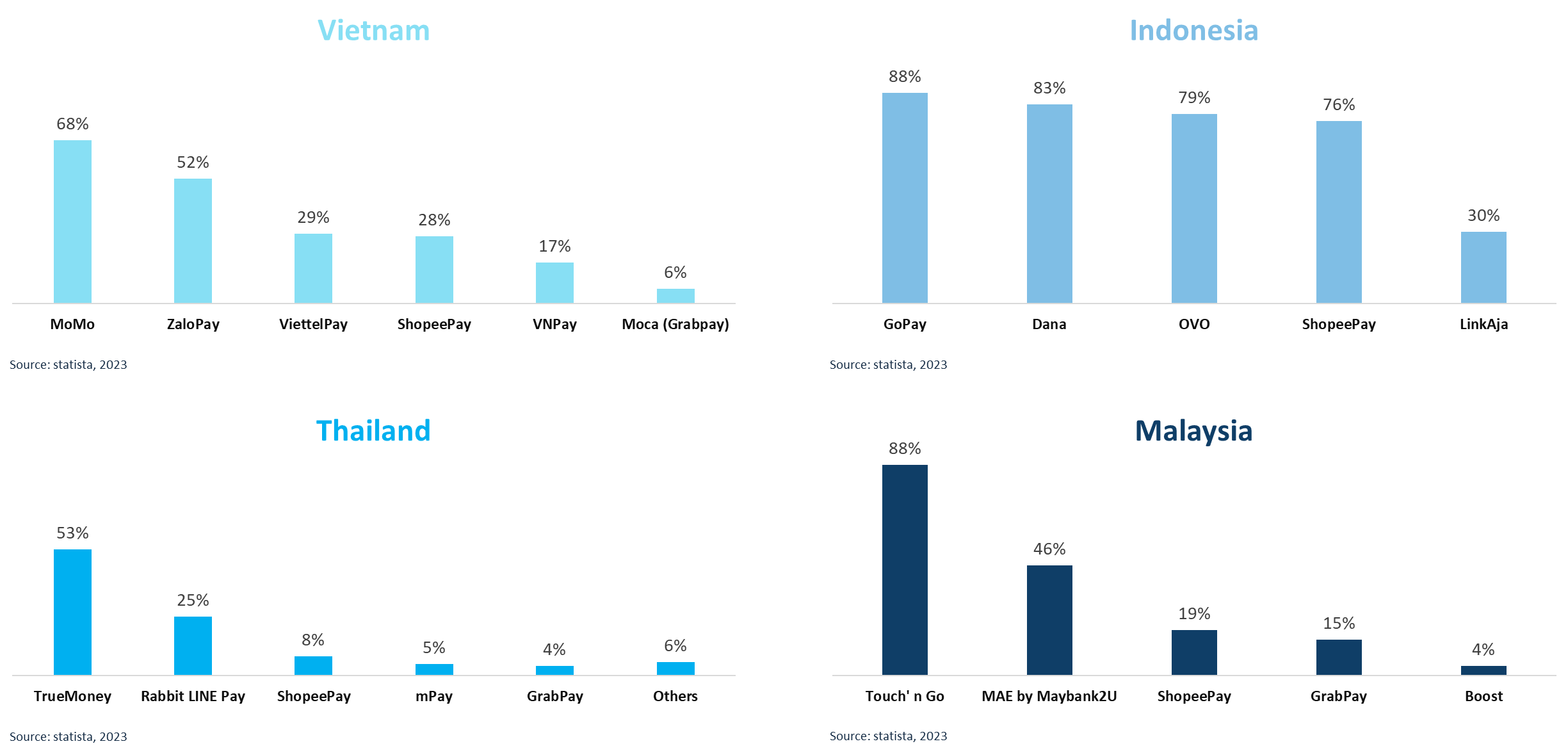
Research indicated that clear authentication, refund confirmation, and transaction status were essential in a fast-growing wallet market.
A mature banking and wallet ecosystem made account tiers, FPX support, and clear limits important to the product model.
The refund journey gave customers an immediate reason to understand and activate the account, rather than asking them to register without context.
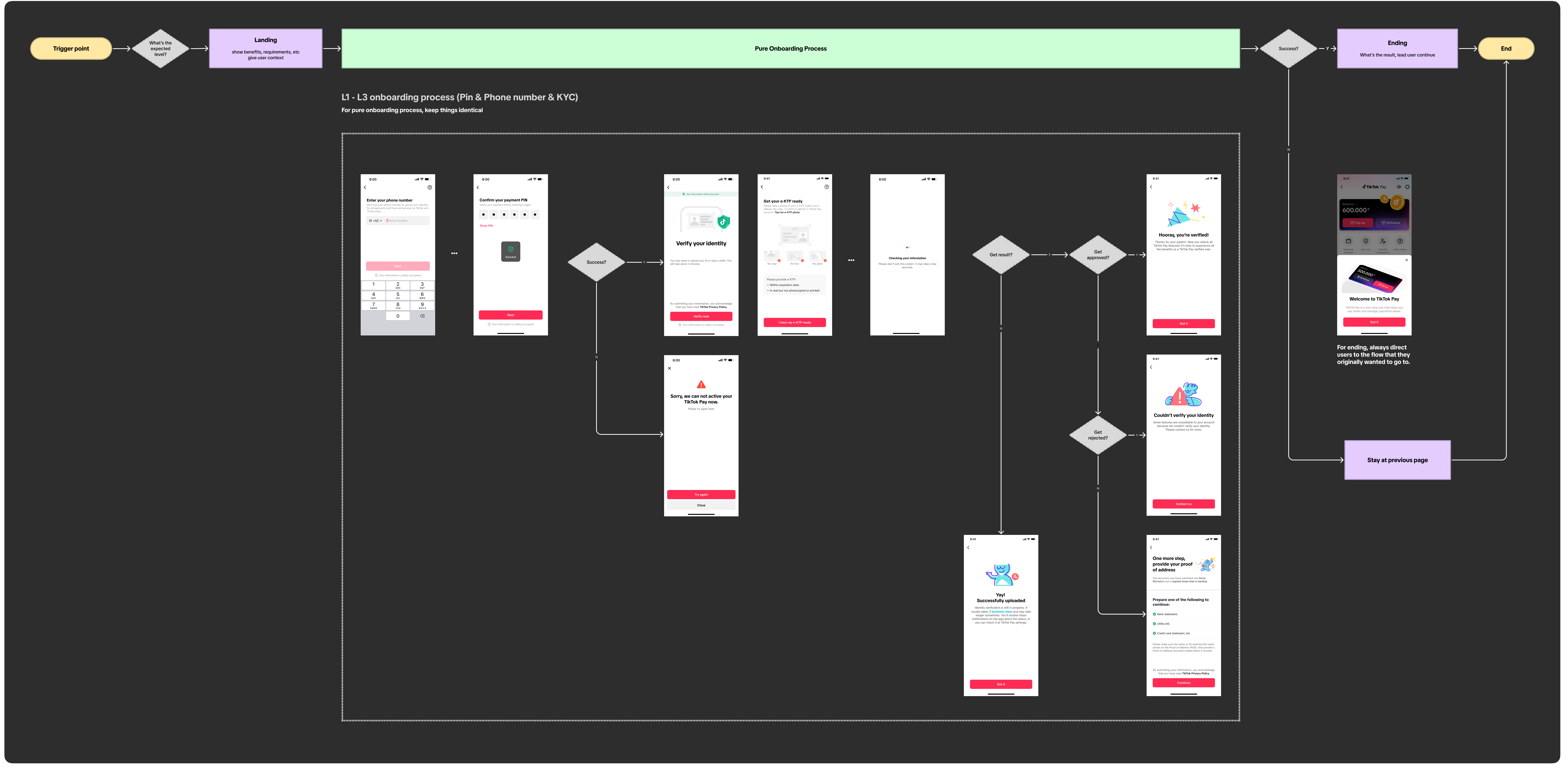
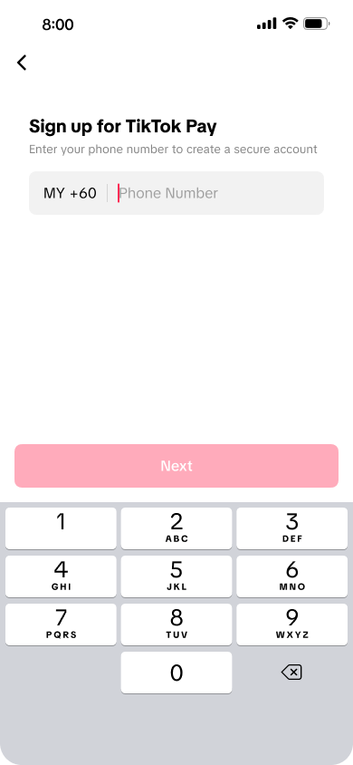
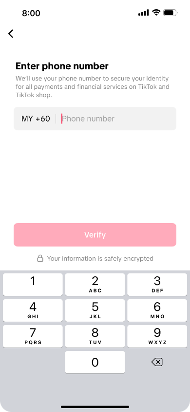
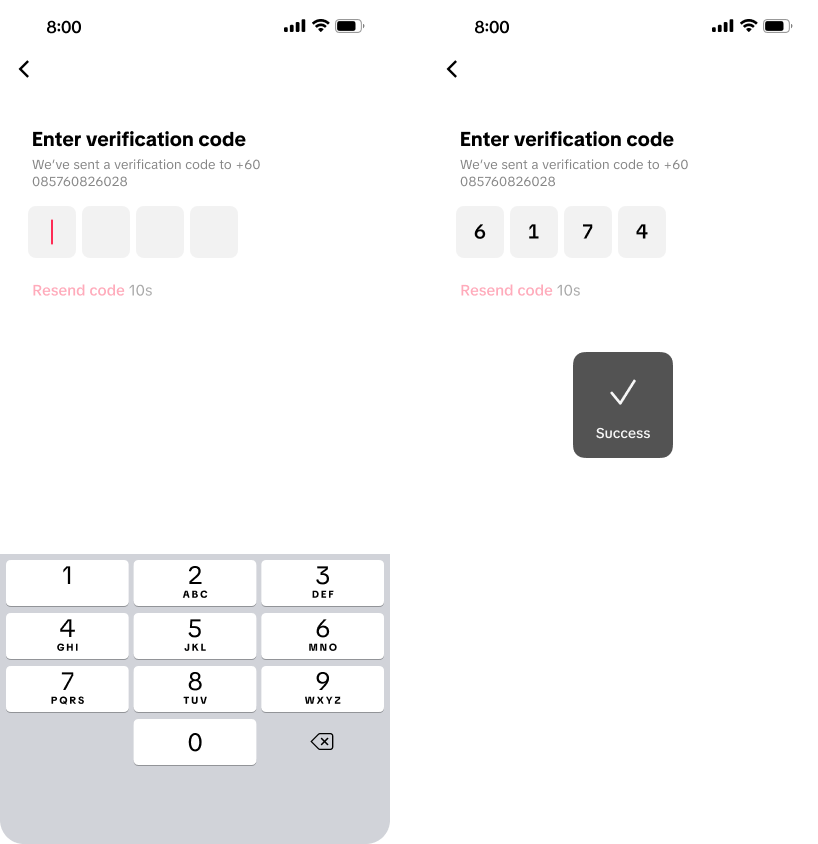
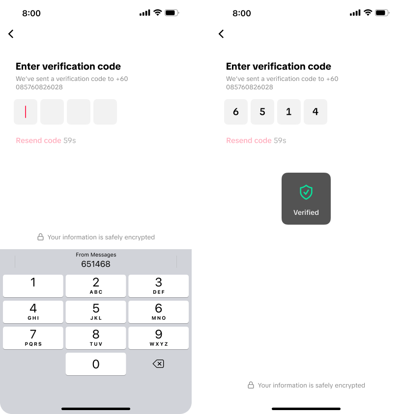
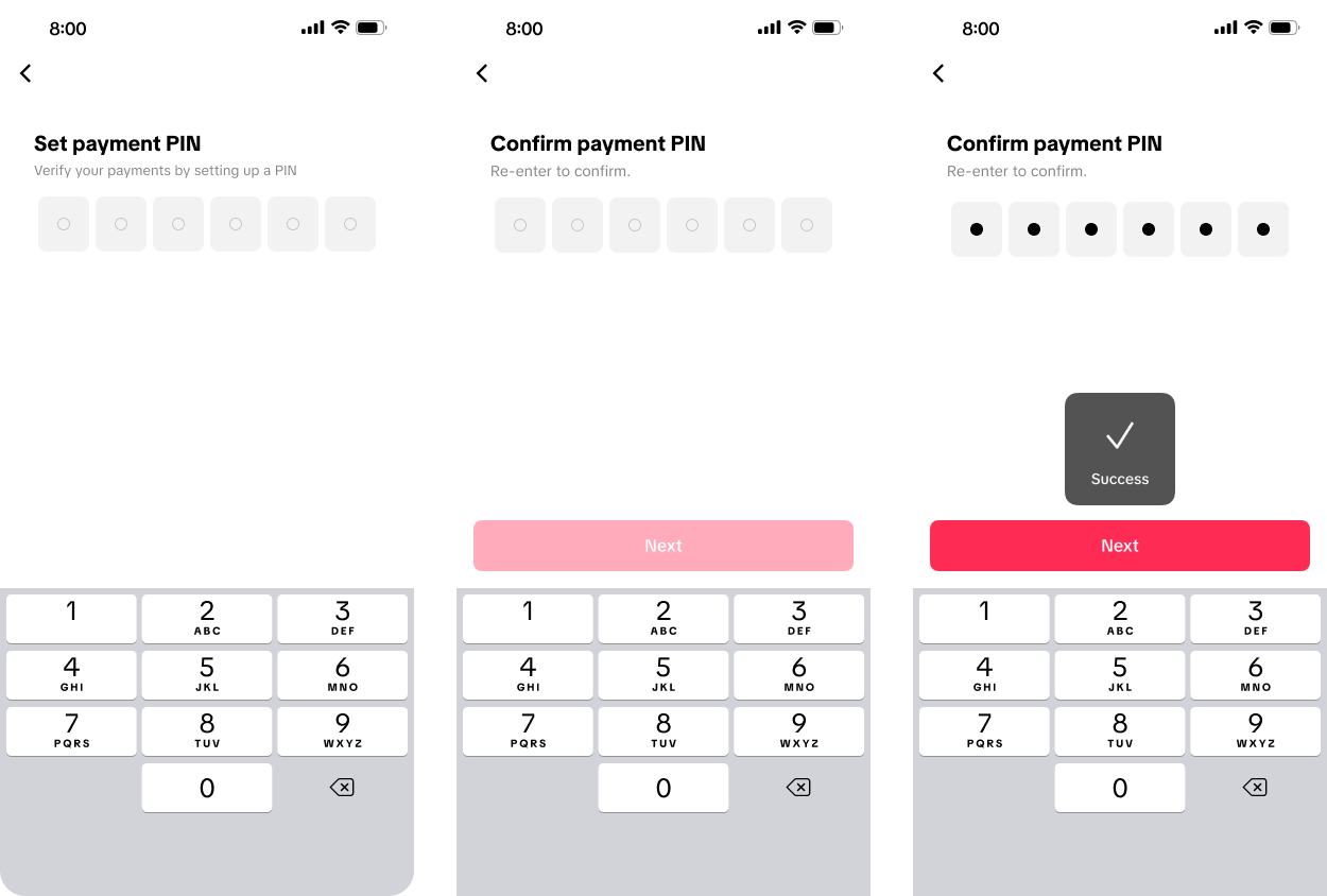
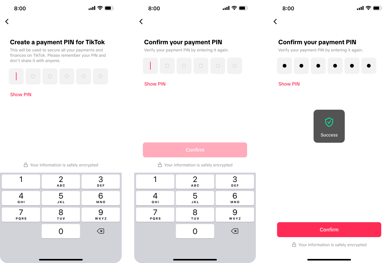
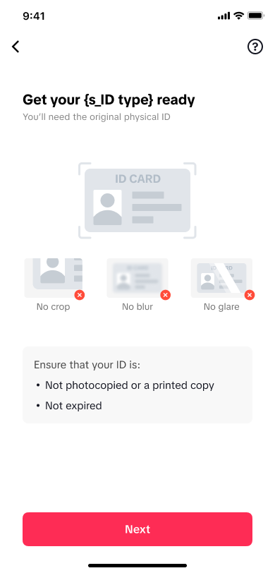
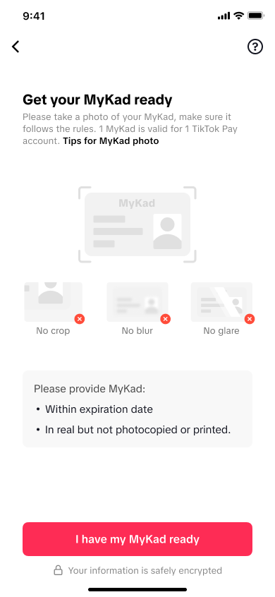
As a regulated wallet, TikTok Pay required KYC. Longer registration flows increase abandonment risk, so the design focused on explaining value, setting expectations, and reducing repeated input without weakening verification.
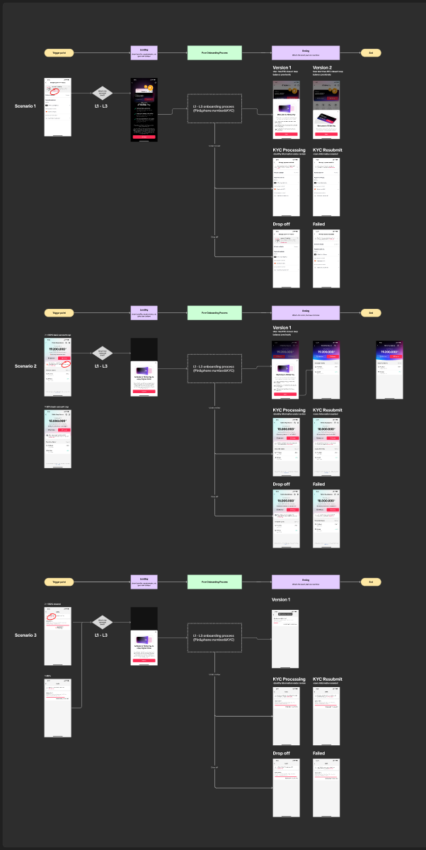
Refund, top-up, payment, and withdrawal entry points used the same account flow but introduced the benefit appropriate to that task.
Customers saw the verification sequence and required information before committing to the process.
A shared PIN, OTP, identity, and consent structure reduced divergence across entry points and markets.
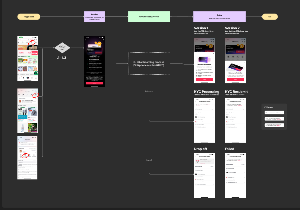

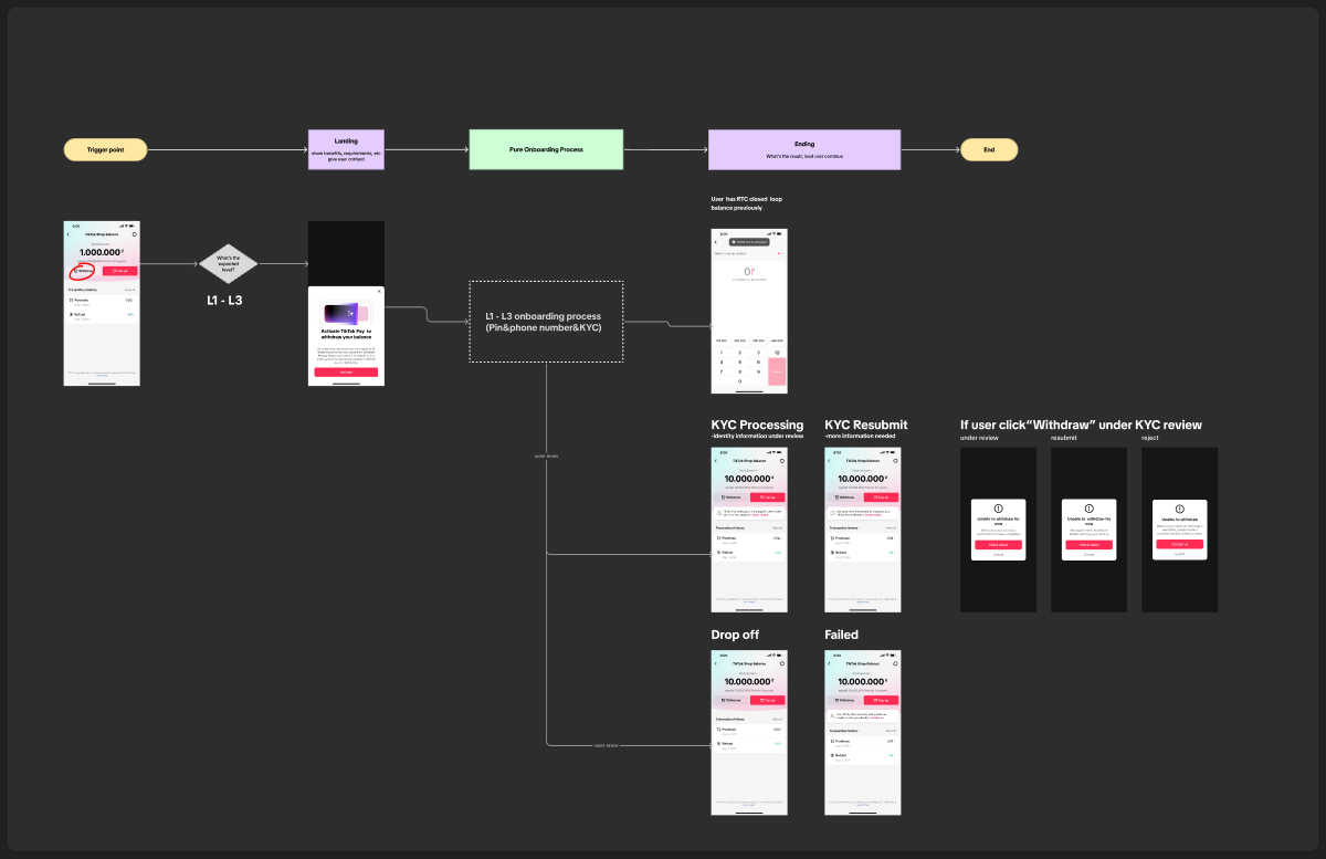
Two comparative product experiments tested whether information structure and trust language changed customer behaviour. Commercial metrics, sample sizes, and absolute conversion values are confidential, so the findings below are presented directionally.
The page needed to establish five ideas before registration: broad payment utility, security, ease of use, relevant benefits, and official TikTok endorsement.
The single-page version produced stronger entry engagement and a modestly better activation outcome. Giving customers one coherent overview reduced additional navigation before a high-commitment financial registration flow.
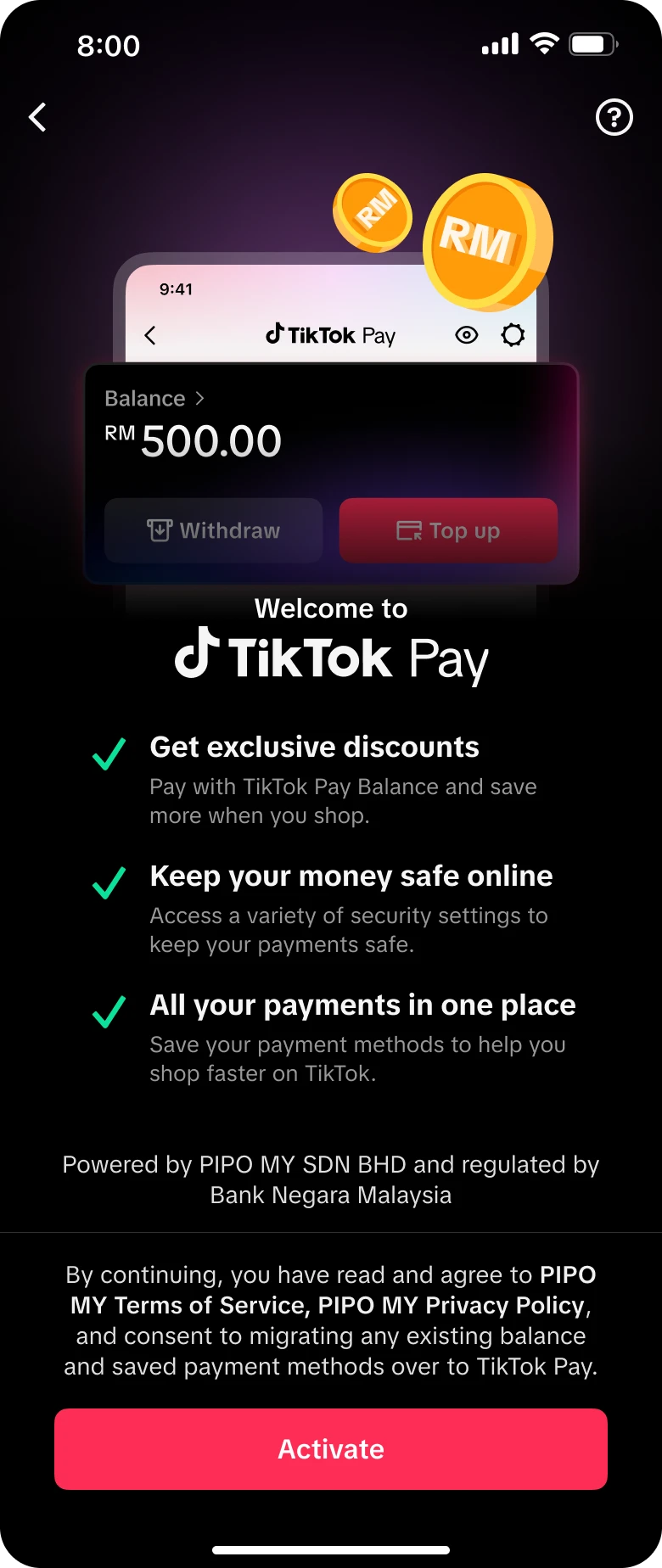
Research indicated that customers were less concerned about the number of steps than about why TikTok Pay needed personal information and how it would be protected.
The trust-led version improved overall onboarding completion consistently across both major mobile platforms. The result supported keeping security explanations within the task, rather than relying on a separate policy page.
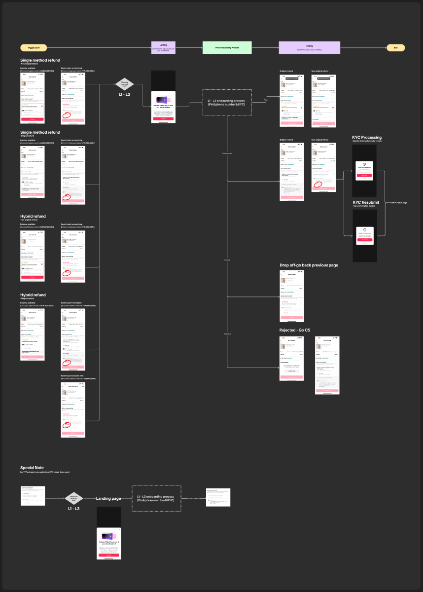
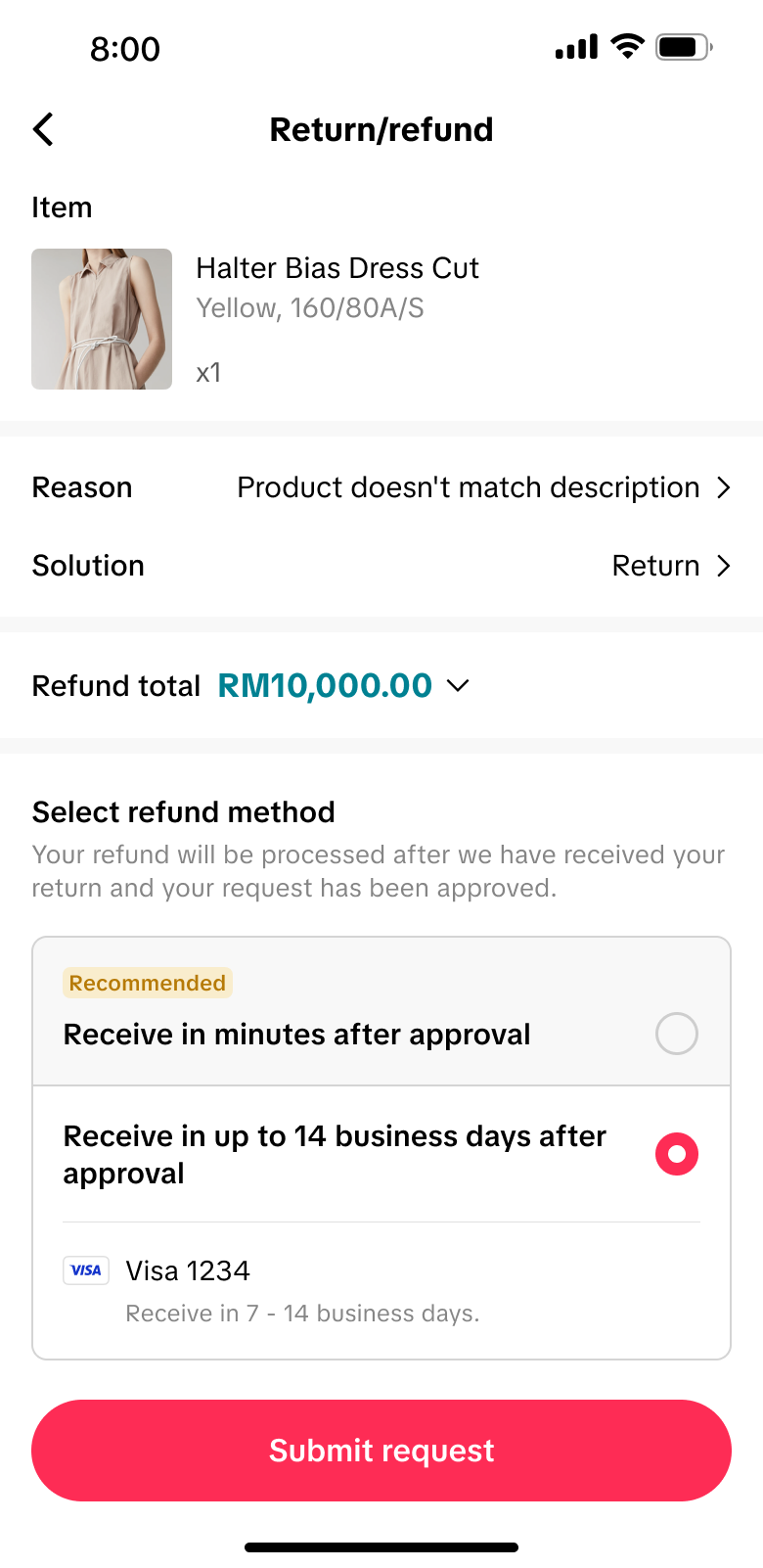
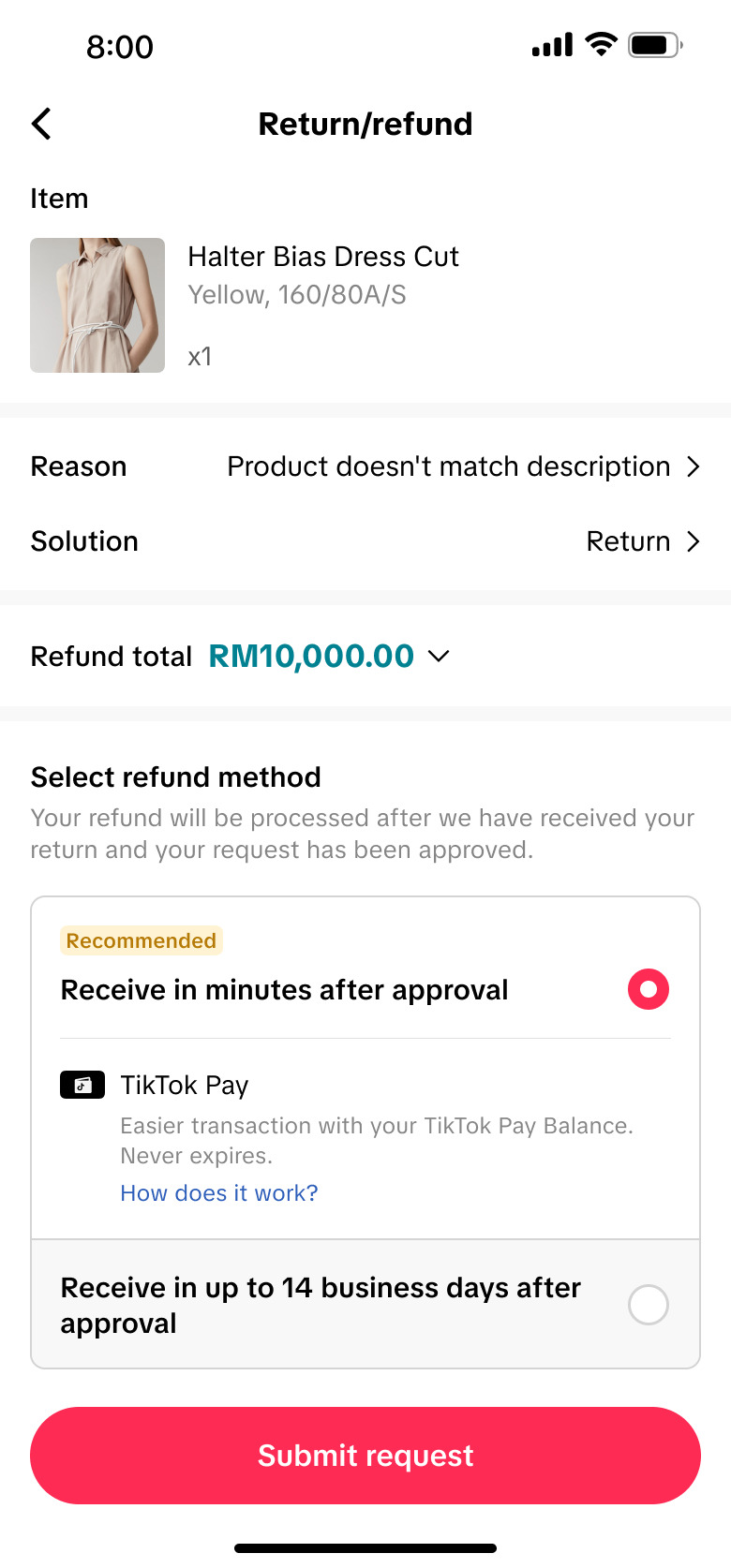
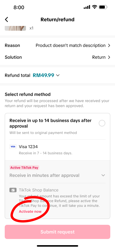
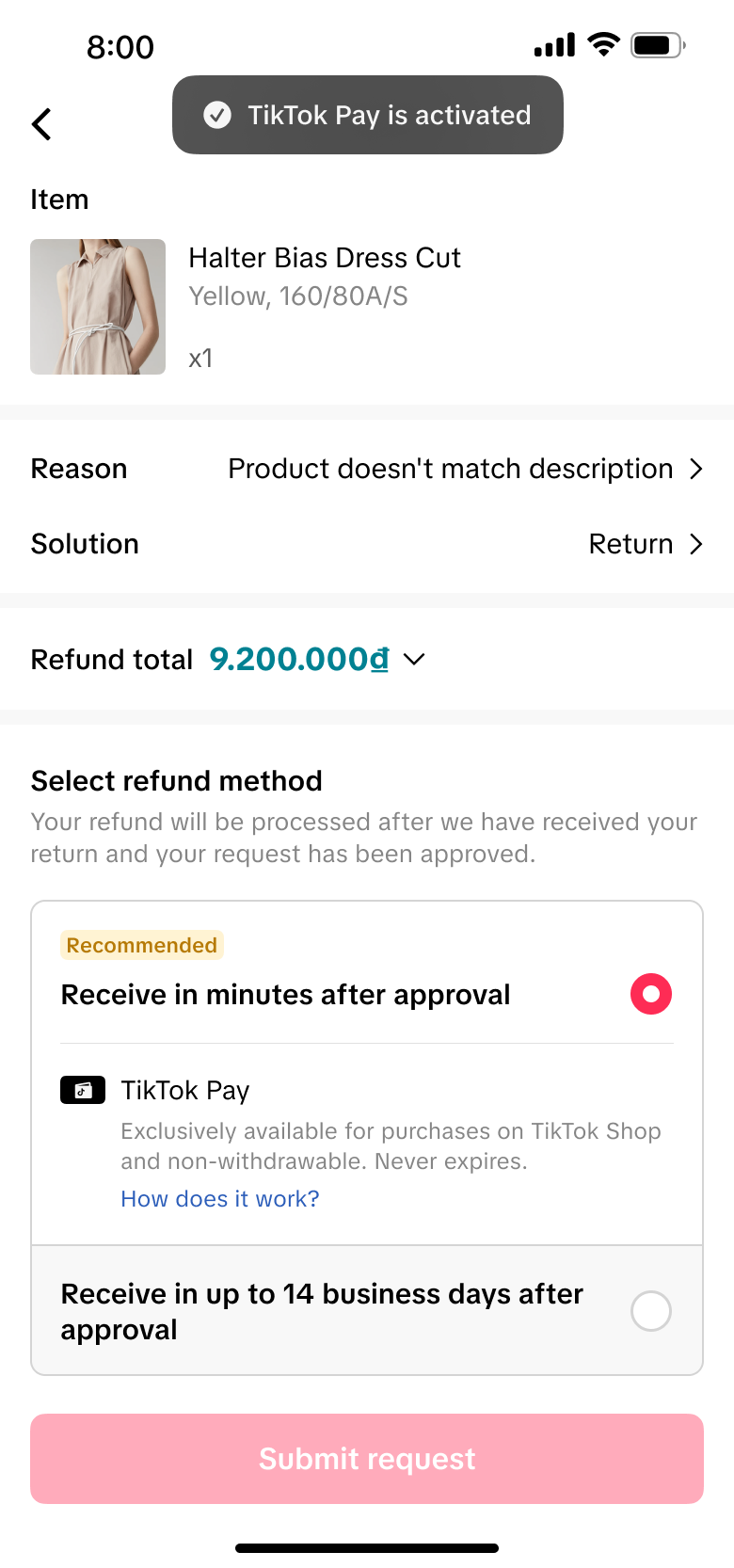
The refund selector needed to explain a genuine service difference without steering customers through visual coercion. Immediate wallet credit was presented alongside the estimated 7–14-business-day timeline for the original payment method, with both destinations clearly labelled.
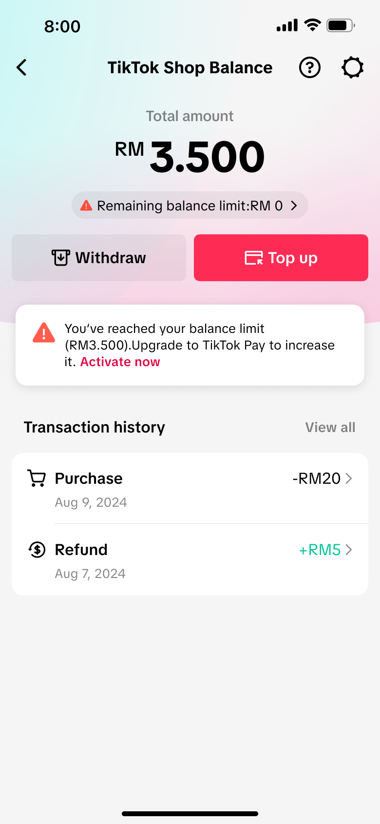
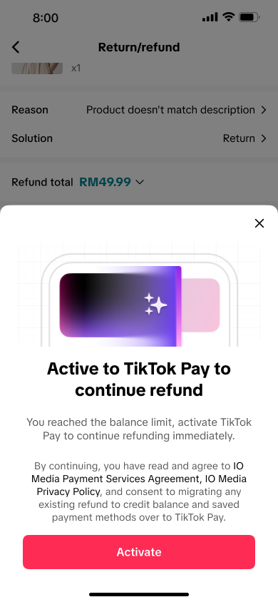
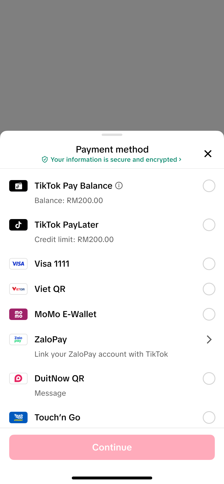
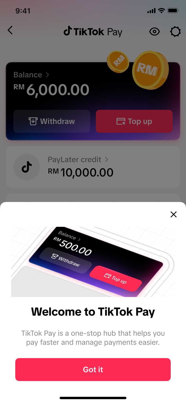
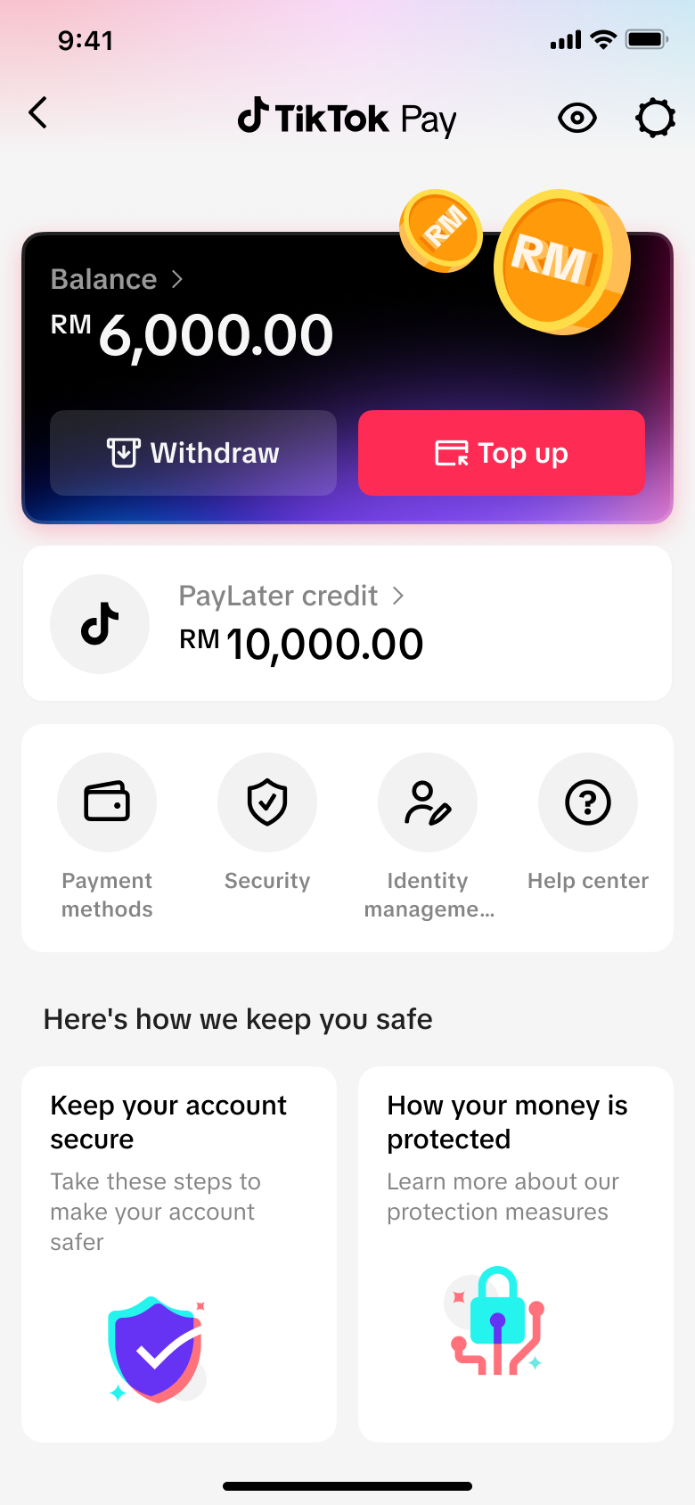
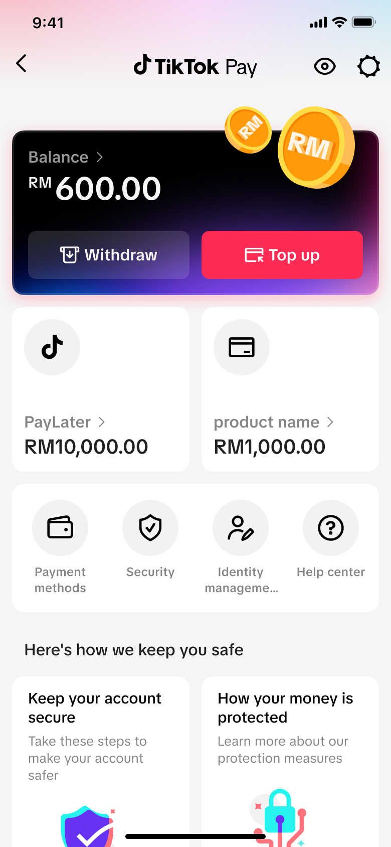
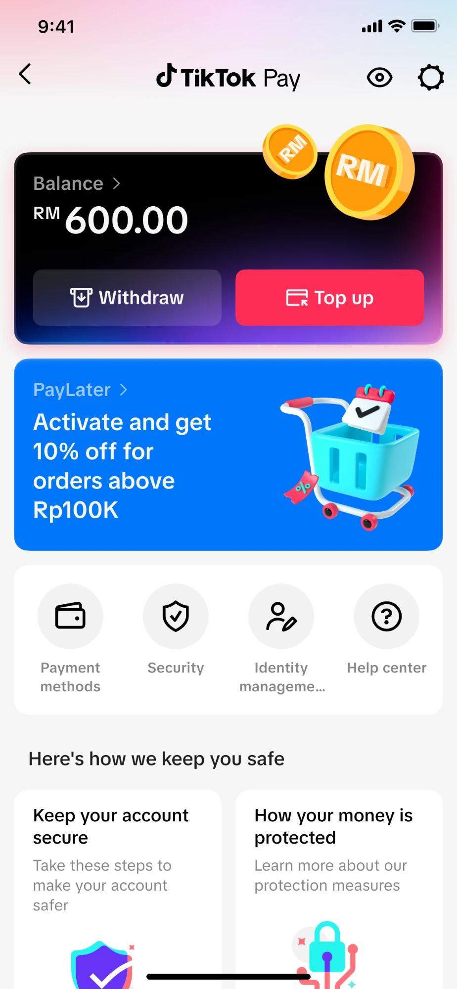
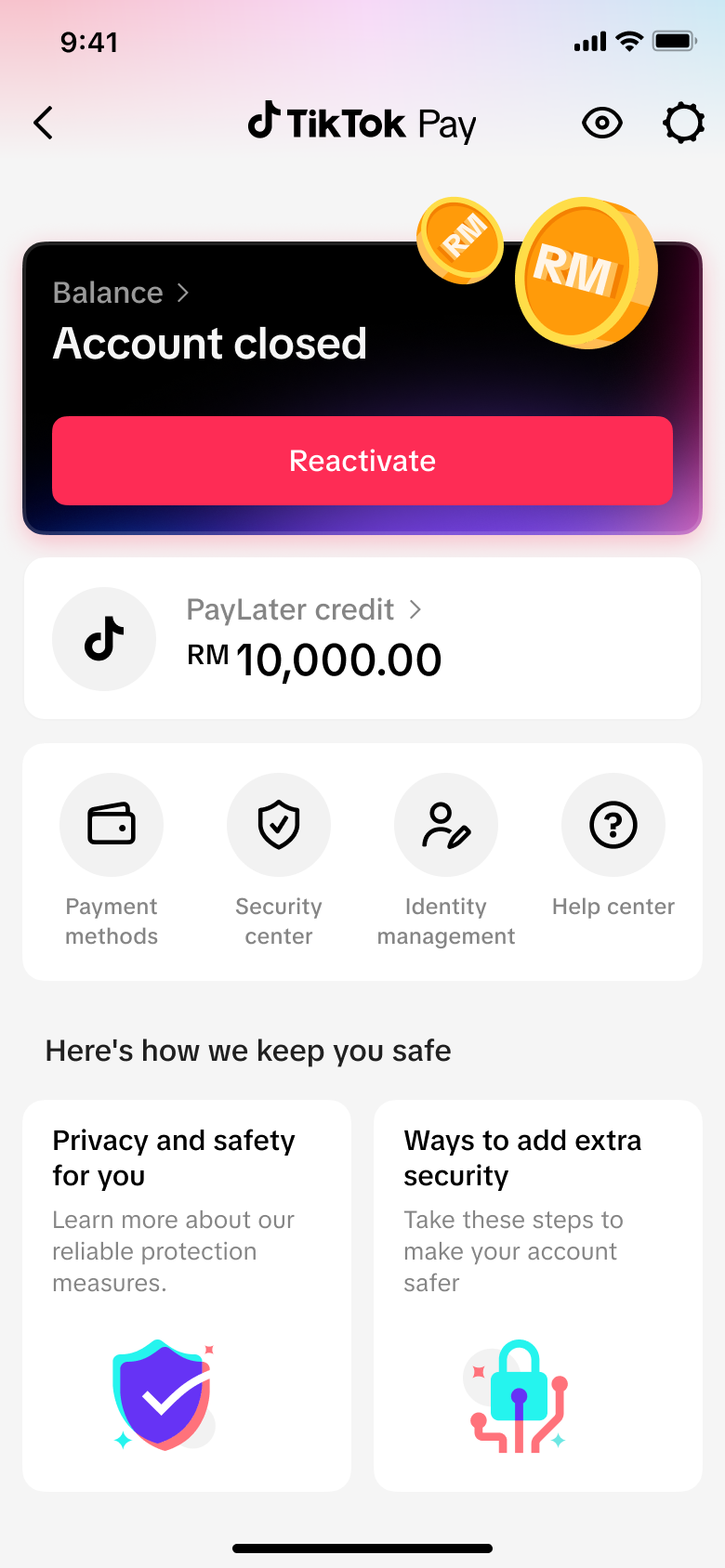
After a refund was credited, customers needed to understand the available balance, transaction history, account limits, protection options, and how to leave the product. The wallet home therefore prioritised money visibility and the next relevant action over promotional content.
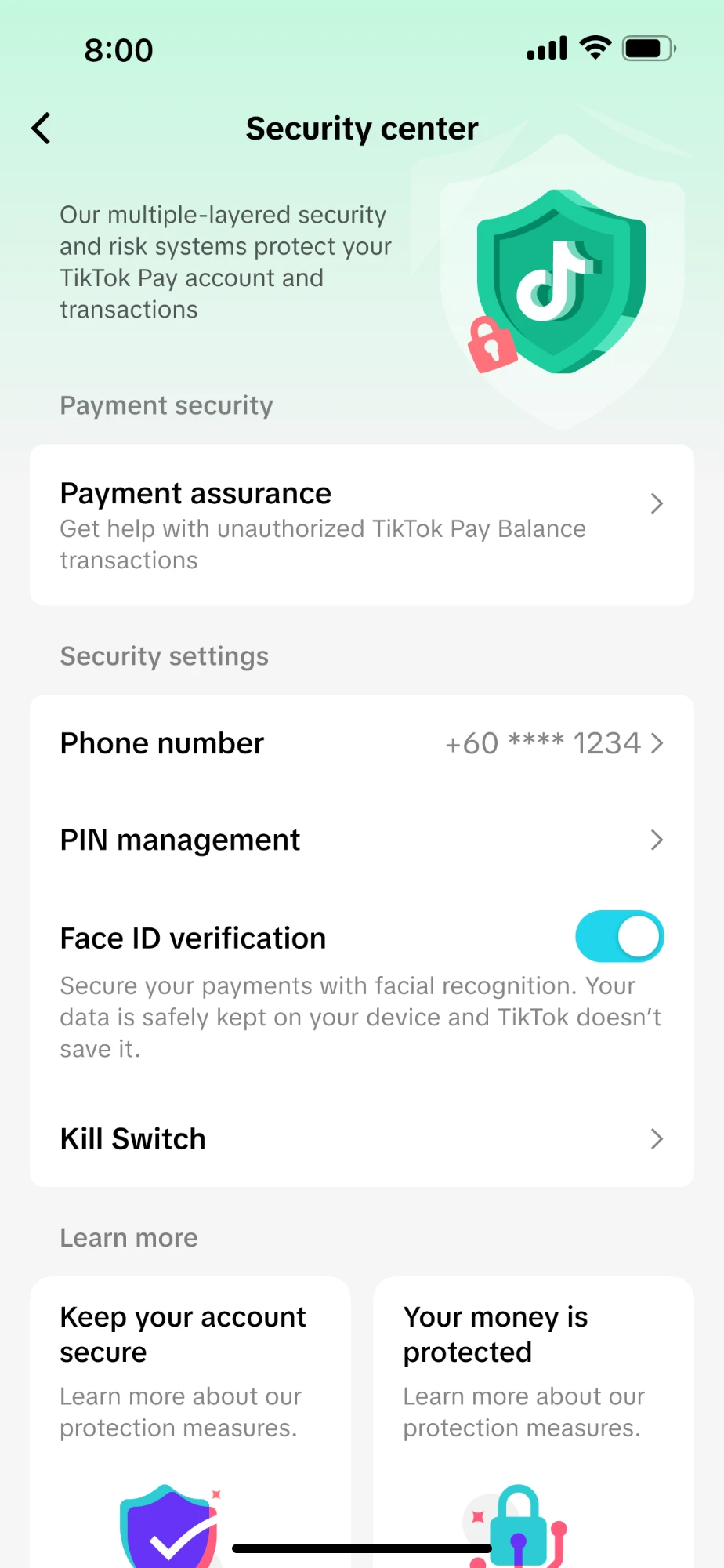
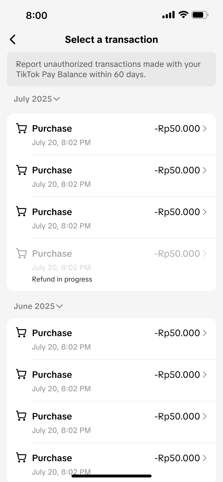
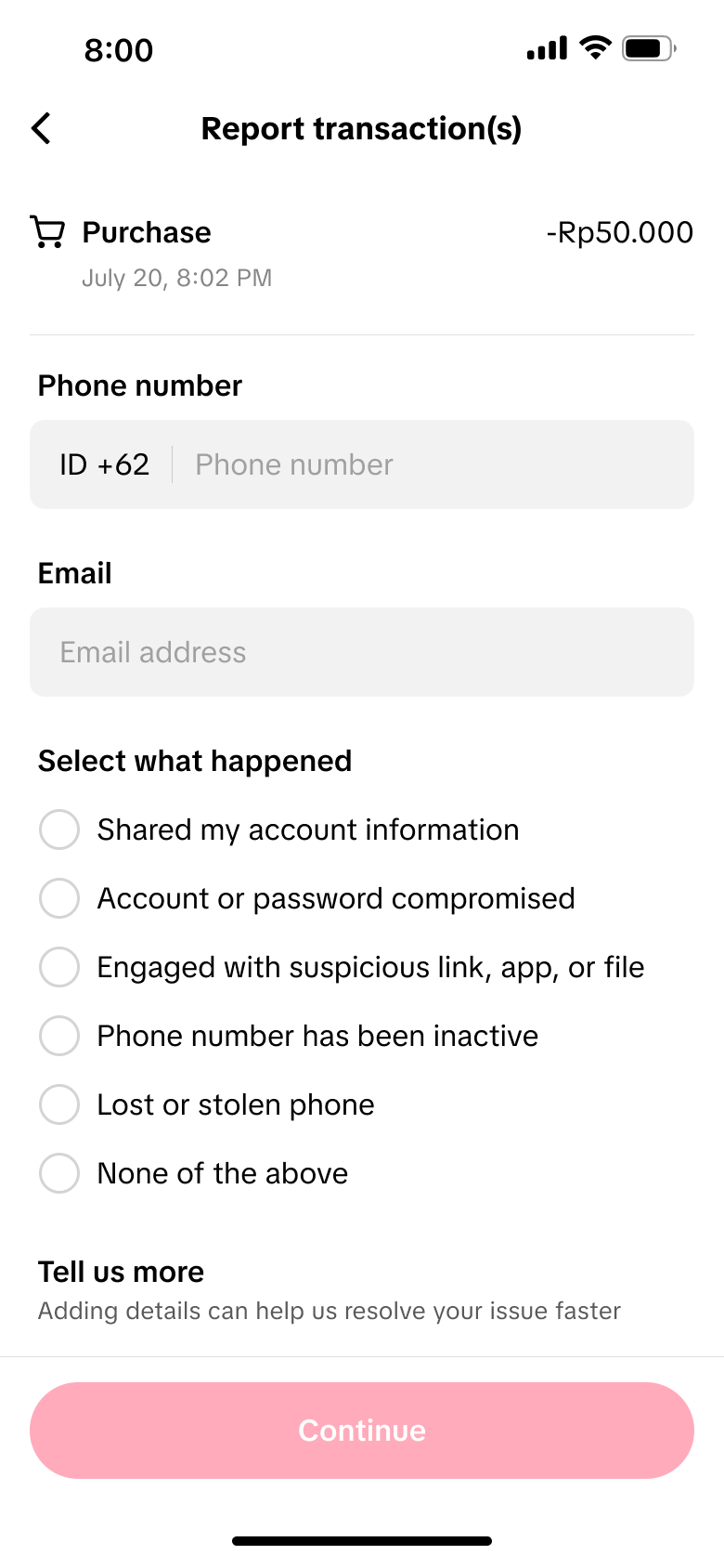
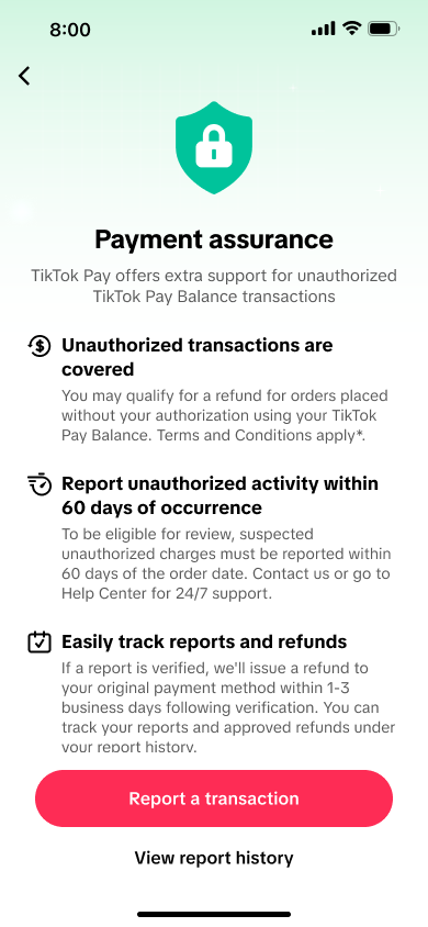
The security centre explains available controls, the scope of account protection, and the information required when reporting an unfamiliar transaction. The language avoids implying guaranteed reimbursement and directs customers to the appropriate review process.
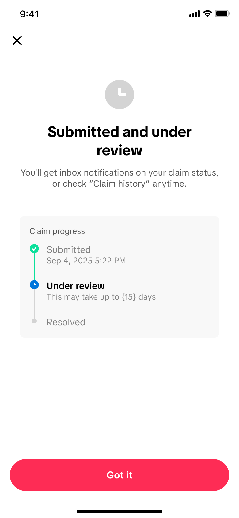
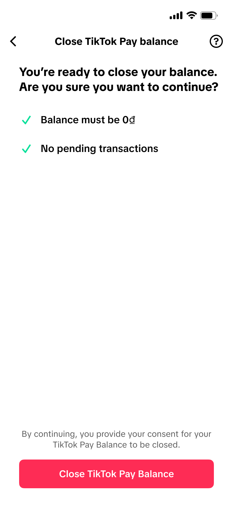
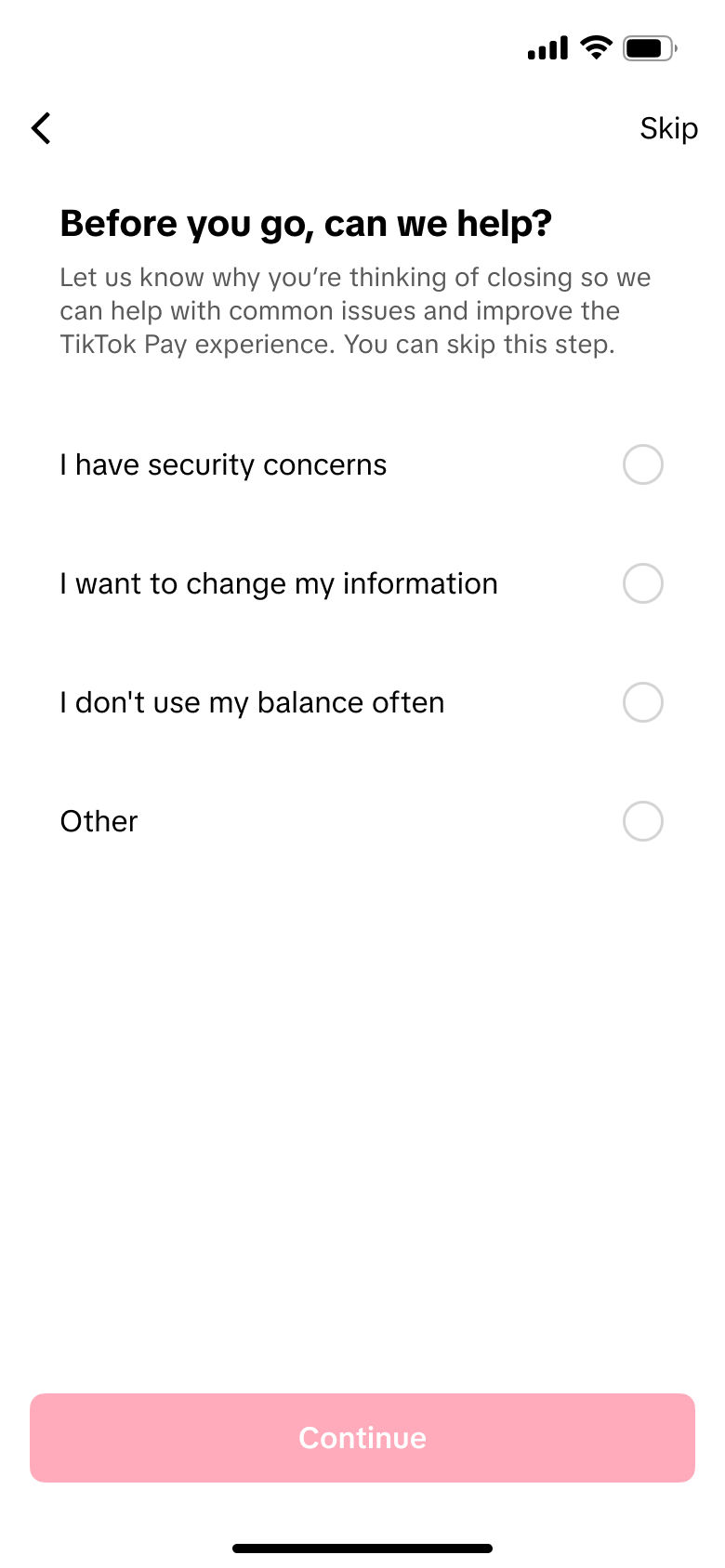
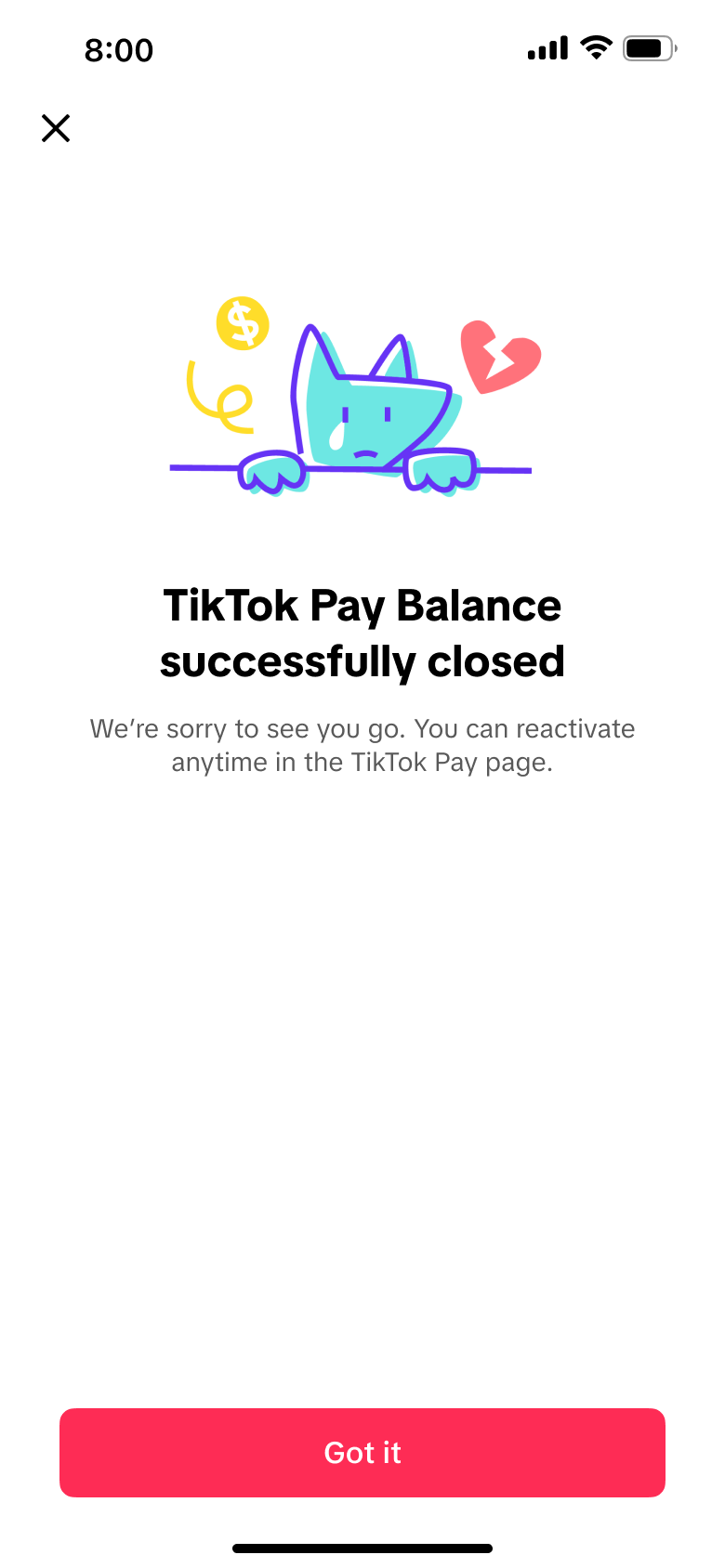
Account closure remains self-service where eligible. The journey checks balance and pending activity, explains the consequences, and provides reactivation guidance in line with market policy and compliance requirements.
Localisation extended beyond translation. Vietnam and Malaysia shared the same wallet principles, but differed in account tiers, limits, payment rails, verification logic, and the expectations created by their existing wallet ecosystems.
Balance hierarchy, status language, consent structure, and security patterns remain consistent.
Account tiers, limits, identity fields, payment methods, and compliance copy are configured by market.
Product, legal, risk, operations, and local research validate each market implementation before launch.
The figures below are directional and desensitised because absolute commercial values are confidential. They describe early post-launch performance and do not attribute every outcome to design alone.
覆盖 Onboarding、余额首页、安全中心、账号架构等核心模块;首先上线越南(VN)与马来西亚(MY),设计框架后续延展复用至东南亚及全球市场。
原支付方式退款可能需要等待 7–14 个工作日,COD 等场景还需要替代退款路径。TikTok Pay 为符合条件的订单提供即时钱包退款,并让余额可以继续用于 TikTok Shop 消费,在缩短等待时间的同时提升余额使用率。
在东南亚市场,交易同时包含 COD、银行卡与本地支付方式。银行卡退款通常原路退回并可能等待 7–14 个工作日;COD 与不支持原路退款的支付方式则需要额外的退款承接方案。
原有的 TTS Balance(闭环余额)存在本质局限,必须升级为持牌开环钱包。
要提供更好的退款体验和余额能力,必须升级为持牌开环钱包;但持牌意味着强制 KYC,这本身就是一道用户门槛。设计的核心命题由此诞生:如何让用户愿意跨越 KYC 门槛,去换一个更好的退款体验?
研究竞品时,我们发现一个反复出现的规律:成功的电子钱包都是先在一个"垄断性场景"站稳脚跟,再向外扩展的。
TikTok Pay 的"垄断性起点场景"是电商退款。这是用户在 TTS 生态内最痛、最频繁、且情绪最强烈(等钱)的时刻。如果我们能在这个时刻做到"退款即刻到账 + 体验远胜竞品",用户就有理由开通并记住 TikTok Pay。
东南亚5国正加速向无现金社会迈进,但各市场受银行体系普及度与政府支持力度影响,钱包发展路径差异显著。理解全局,才能精准定位 TikTok Pay 的切入优先级。
越南:银行体系薄弱 + 用户天然信任平台钱包 → 开环壁垒低,TikTok 平台属性即竞争力。
马来西亚:支付方式成熟、用户决策理性 → Paylater 是差异化突破口,直播电商高频交易是天然切入场景。两市场覆盖「高速新兴」与「成熟有缝」两种 SEA 典型形态,研究结论具代表性与对比价值。
结合竞品格局与用户访谈,深入理解两市场差异,明确 TikTok Pay 在 VN 和 MY 的差异化切入方向。
VN:安全感是 TTPay 的核心差异化。用户反映 MoMo 在 TTS 支付无需认证,反而让他们感到不安全,这直接驱动了 Onboarding 中「审核态状态透明」的设计决策——让用户在每个支付关键节点都感知到 TTPay 的安全保护。
MY:Paylater + 直播购物 = 最强破局组合。这一洞察推动了 Wallet Home 快捷支付入口的优先级决策,确保直播抢购场景下 TTPay checkout 体验最优。
Phase 1 最大的用户门槛是 KYC,我们研究了本地竞品的开户门槛:
设计启示:我们无法绕过 KYC(合规硬约束),但可以① 让 KYC 的过程感觉值得,以及② 利用 MY 的 Basic 账户机制先体验再升级,降低冷启动门槛。
两组对照实验分别验证信息组织方式与安全感文案是否影响用户行为。商业指标、样本量与绝对转化数据均属敏感信息,以下只保留实验方法、方向性结果与由此形成的设计决策。
用户在开始注册前,需要理解支付场景、安全性、易用性、相关权益与 TikTok 官方背书五类信息。
单页方案带来了更强的入口互动,并在开通结果上保持小幅优势。对于需要较高投入的金融注册流程,一次建立完整认知比增加翻页探索更有效。
用研发现,用户担心的重点不是步骤数量,而是为什么需要提交个人信息,以及这些信息会如何被保护。
信任增强方案在两大移动平台上都带来了更好的整体完成表现。因此,安全说明被保留在操作现场,而不是只放在独立政策页面中。
MY 的 Basic 账户机制带来了额外机会:用户在申请退款时,如果 Basic 账户余额已满(账户余额上限)或需要提现,系统会自然触发 Verified 升级引导。这个时机比"首页弹 KYC 引导"更有效——用户在退款场景下有明确的升级动机("我需要提现这笔钱")。
每个触发场景的 Landing 页上下文不同、结束态各异,但注册核心流程(L1-L3 Pin & Phone & KYC)保持统一——这是在有限工程资源下最大化设计覆盖的系统决策。
核心矛盾:用户更倾向于"退回原卡"(熟悉、确定感强),但对平台而言"退到 TikTok Pay"才能带来资金沉淀和复购机会。如何让用户主动选择退到 TikTok Pay,而不是依赖强制或默认勾选?
时效差异本身就是最强的说服力,不需要通过视觉层级压制竞争选项。
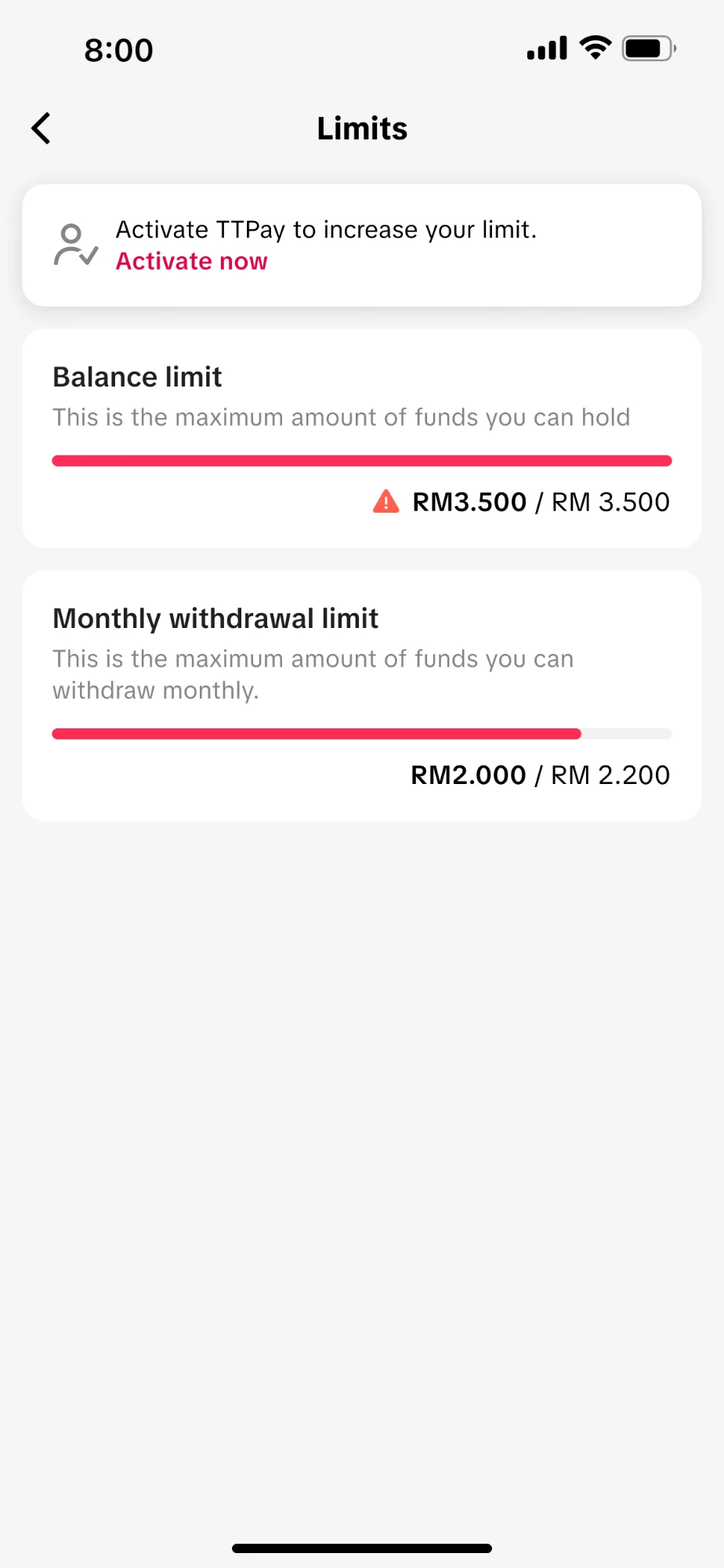
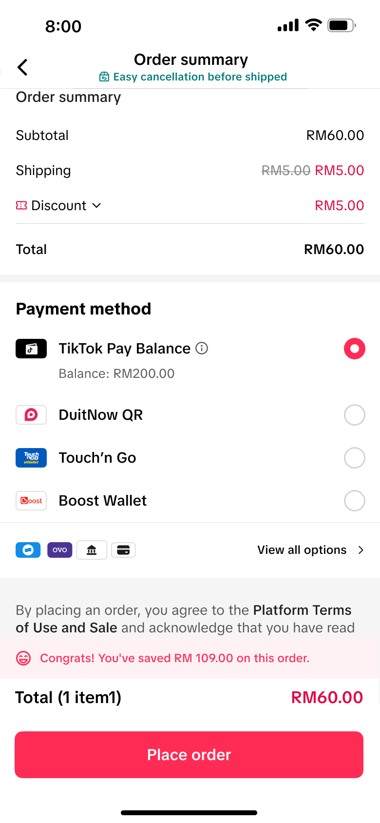
设计目标不仅仅是"展示余额",而是让用户感知到余额是"有价值的、随时可以用的购物力",从而主动充值和消费,而非在余额到账后立刻提现离场。
同一套产品框架需要在两个市场产生截然不同的用户体验,同时又不能为每个市场单独做一套设计——工程和设计成本都不允许。
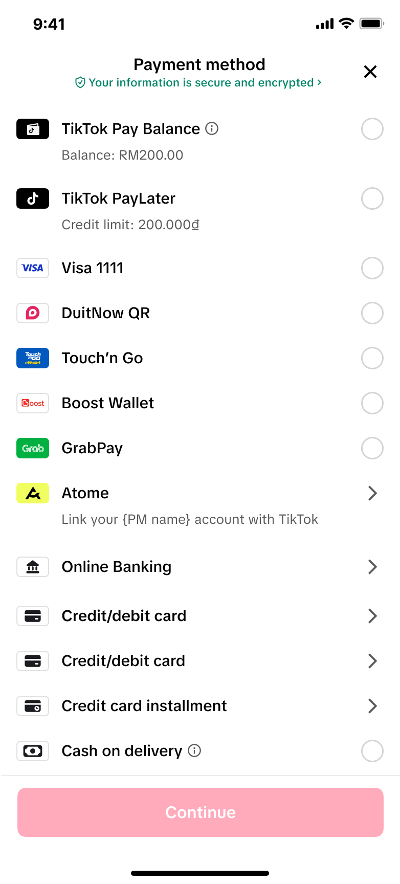
这个项目让我深刻理解了"灵活性 vs 一致性"的设计权衡。正确的做法是找到"不变的骨架 + 可变的血肉"——骨架(信息架构、核心流程、设计系统)保持统一,血肉(文案、支付方式、账户规则)可配置。设计解法:参数化组件而非复制粘贴,PI 管理组件通过"支持绑定/仅展示/需跳 App"三种 mode 参数控制不同支付方式的交互行为。
量化成果为产品上线初期数据;定性成果来自监管审计结果与设计框架复用情况。